In this Intro to Industrial Engineering assignment, we were tasked to create four assertion evidence slides based on analysis of data we choose. We choose to analyze data from National Collegiate Athletic Association (NCAA) Division One (D1) Men’s Basketball from the years 2013-2024. Each slide includes a graph created using skills learned from our Intro to Industrial Engineering class.
In our data set, each row represents a team during a specific season and includes offensive and defensive efficiency, power ratings, shooting percentages, rebounding rate, tournament seeding, and tournament finish.
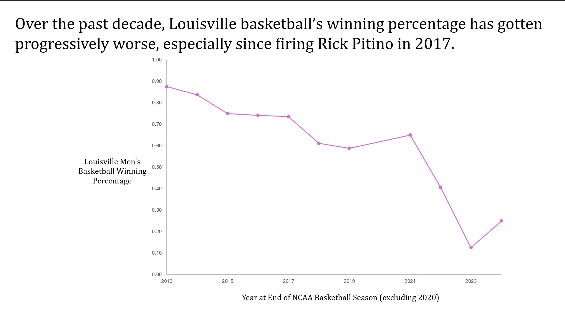
The first question we asked: “How does firing a coach effect a teams winning percentage?” To do this we created a pivot table to create our time series data we wanted. First, we made our rows each year in our data we have which is from 2013-2024. We then filtered our data to find teams that were heavily effected when it came to their success after a coach was fired. From there we found that Louisville had a good data set in which after they fired their coach, their success went down. From there we found winning percentage through taking wins divided by games played. Then we made a time-series plot with the x-axis being year and then winning percentage in y-axis. What we found in our time-series plot allowed us to make the following assertion:
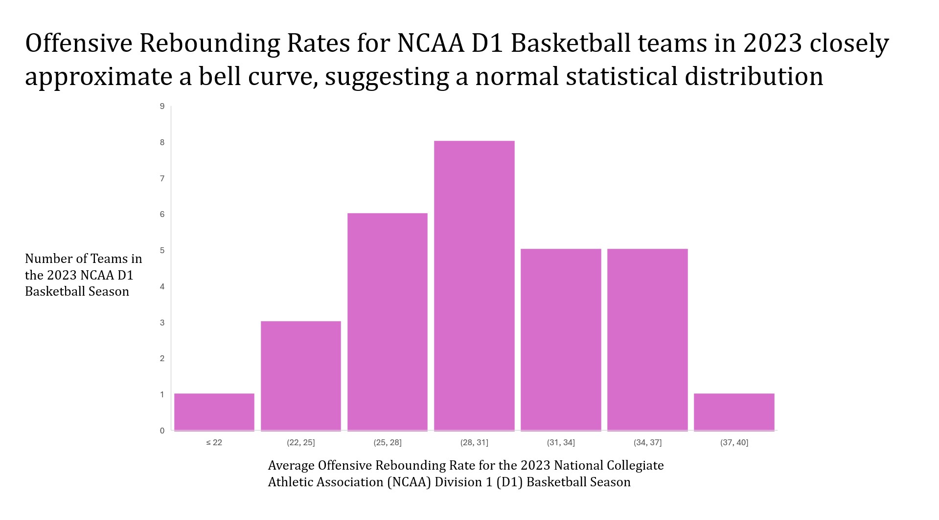
Our next question asked: “What is the statistical distribution between Offensive Rebounding rates for the 2023 Season?” This assessment has particular significance in determining how offensive rebounding rates fluctuate within offenses over a specific season. We took advantage of the already developed Offensive Rebounding rates per team to achieve our results, using a filter to return only data from the 2023 Season. This gave us clean, relevant data to create a histogram that could then be manipulated with respect to bucket size, axes titles, and other features. The shape of the histogram allowed us to interpret the distribution and make the following assertion:
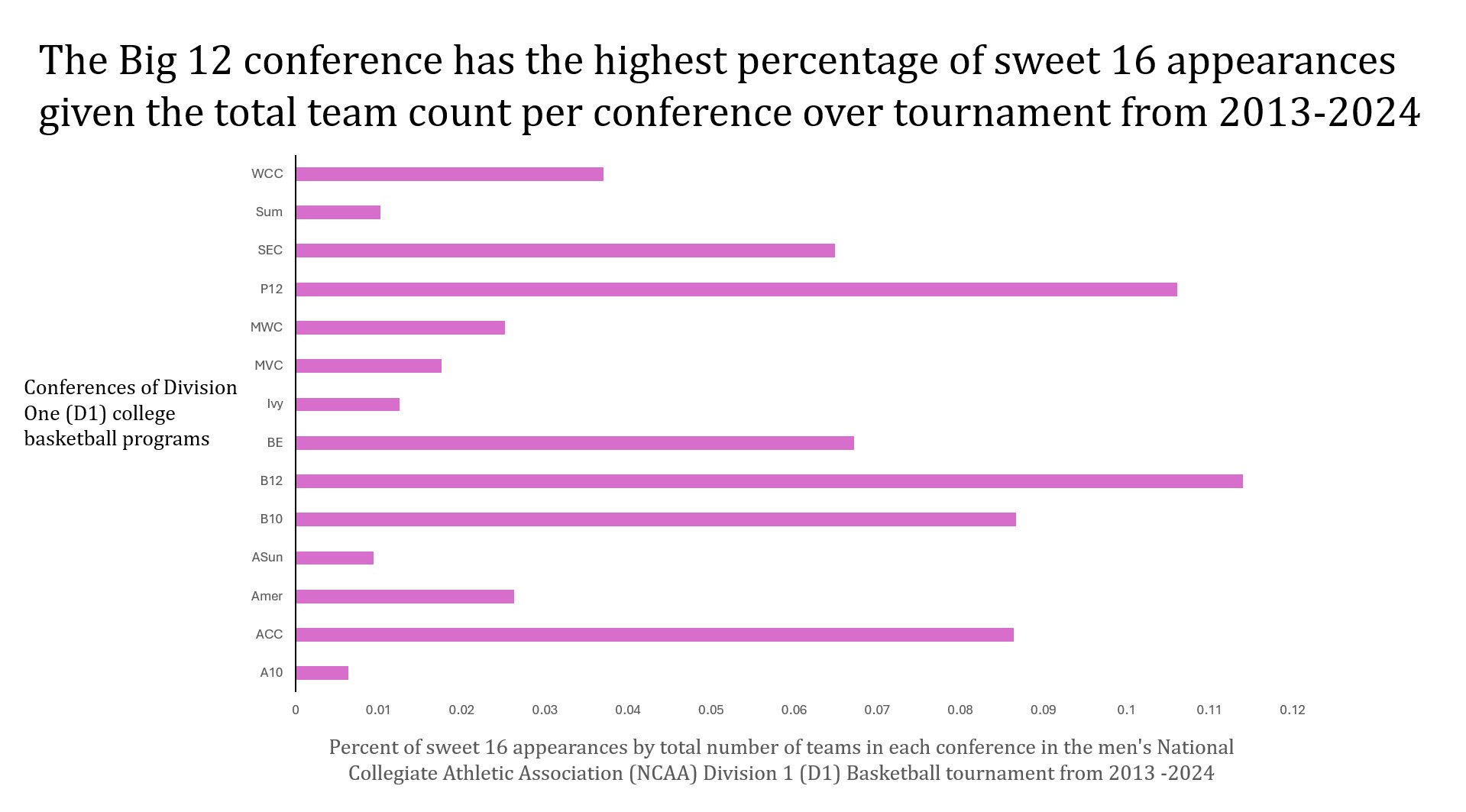
Our third question: Is there a dominate team in the postseason of Men’s College Basketball? This was interesting to us to see how teams compared to each other on an even playing field. To do this we created a pivot table of all the data to identify the total number of teams in each conference over the time frame 2013-2024. We then sorted all the data by most sweet sixteen (S16) appearances getting rid of all the teams that did not have an appearance. Once we got all this data, we divided S16 appearances by total number of teams. This evened out the playing field for smaller conferences and we see who had the highest percentage of S16 appearances. We then graphed this on a bar chart with the corresponding team on the Y-axis and percentage on the X-axis. We then changed the color of the columns and pasted the graph into power point where we added axis titles. Once this was all done, we were able to make the following assertion on S16 appearances:
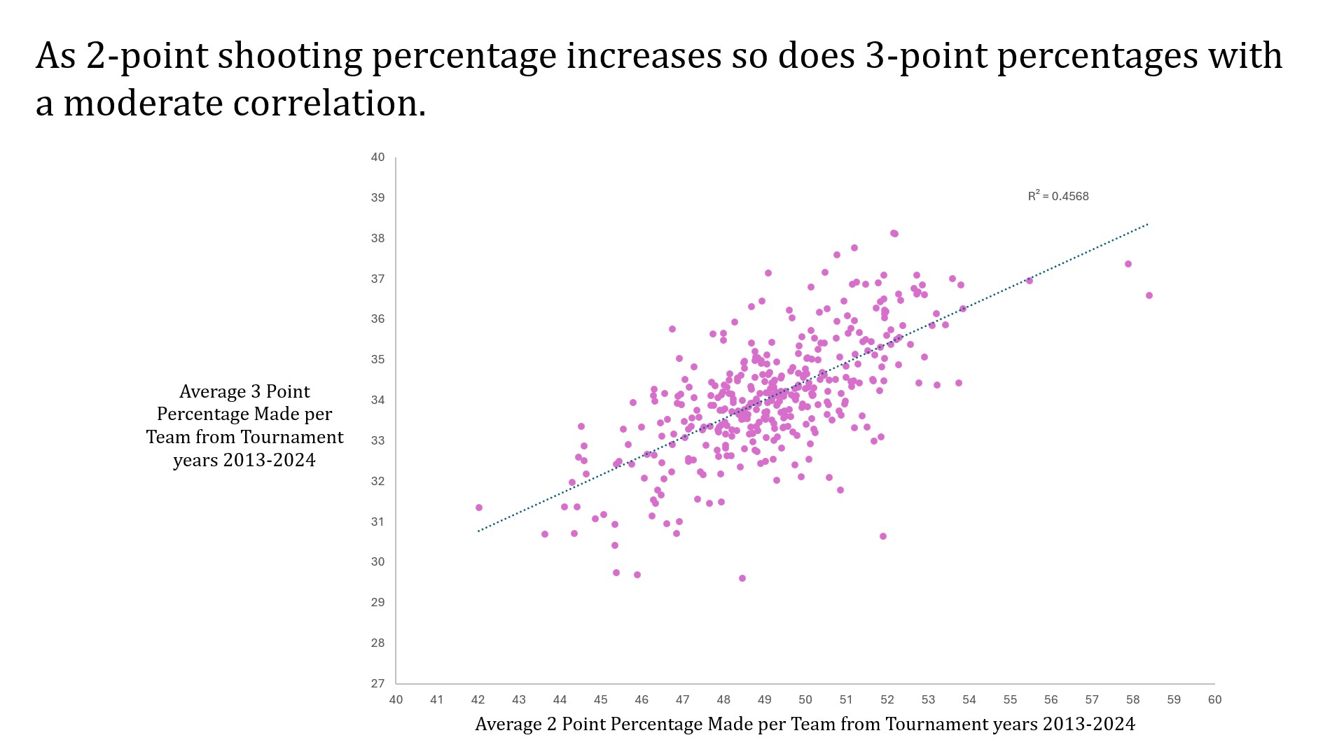
For our fourth question, we asked: “Is there a correlation between 2-point and 3-point shooting percentages?” This question was interesting to us because in college basketball, some teams are known for their ability to shoot the ball well. To do this, we plotted 3-point shooting percentage on the y-axis and 2-point shooting percentage on the x-axis. We then changed the range on the axes so that the data was more readable. We also added a trend line and found that there was a moderate correlation: